An introduction to layers.
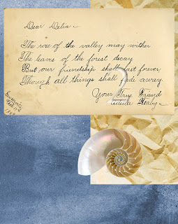
The three components of the top image are all on individual layers.
They have been re-sized , moved and flattened to create the final image above.
It is possible to copy a component that is selected within a layer by holding ALT whilst the object is selected and then dragging a copy of the object to its new location.
From the initial image above,
I have used some of the different selection tools to copy the individual vegetables.
Once they have been copied, I have pasted them onto a separate layer and renamed this layer. I have then moved the vegetables onto the chopping board and re-sized and rotated them to create the final image.
 |
| Original Image |
 |
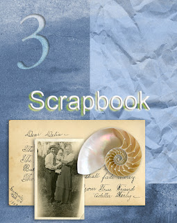
The black and white photograph was added to this composite image by simply opening it and then dragging it across the screen into this image. The individual components of this image have then been rearranged and re-sized. A drop-shadow has then been added to each component to give the image more depth. The text SCRAPBOOK was also added using the text tool. This was also given a drop shadow.
Smart Filters
|
Original Image
Horizontal Motion Blur
Vertical Motion Blur
Filter-Stylize-Solarize
To apply a smart filter. Firstly, the area to have the filter applied must be selected.
Then use the command, FILTER - CONVERT FOR SMART FILTERS.
Then the required filter can be added to the image.
Adjustment Layers.
An adjustment layer can apply tone and colour adjustments to an image without permanently altering the final image. i.e. the adjustment is only on the adjustment layer.
The original colour image above has been altered with an adjustment layer. Firstly, to convert it to black and white. Secondly, to tint it using hue, saturation and lightness.
This can be achieved by using the command: LAYER-NEW ADJUSTMENT LAYER and then selecting the layer adjustment of your choice.
Levels adjustment.
Colour Balance Adjustment.
The 2 images above have also been adjusted using an adjustment layer.
Layer Mask
The above composite image has been created by combining the three images above and then by using a layer-mask, I have cut a shape out of the clouds the same shape as the man so that he ids visible in this image.
From the same original image, the salad items have been individually cut out and placed on the chopping board as before. Only this time, using the layer mask instead of the quick selection tool.
Int the last image above, a drop-shadow has been applied to the items on the chopping board.
Removing Wrinkles Using A Layer Mask
To remove wrinkles from a subjects face. A duplicate layer should be created and a soft gaussian blur should be added to the copied layer.
To apply a layer-mask. Copy the layer and depress they mask icon at the bottom of the layer palette. Then click on the layer-mask icon itself.
Using the layer-mask on the pigeon, a motion blur has been added to increase the impression of movement.
Blending Modes.


