Graffiti - Research Images.
I have been fascinated by graffiti for many years.
During my travels in Spain a few years ago, I randomly found this deserted paper mill.
Upon looking through the window, I was presented with a wealth of graffiti unlike anything that I had seen before.
Almost every edge of every wall was painted.
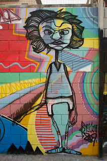
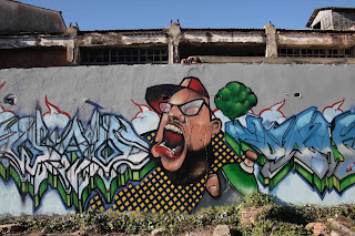
Some of the images were portraits and were incredibly detailed and accurate considering that they had been produced using only aerosol spray-paints.
I found these 2 images in Barcelona in 2009 and again I was struck by the nature of the portraits.
This image has always been one of my favourites.
My intention for this part of the brief was to use this shot as a background and using my new Photoshop skills, to carefully select some of my favourite elements from other graffiti images and to combine them into one final image as if they had actually been painted onto it.
My inspiration for this idea was the surreal nature of the work of Salvador Dali.
Although I have not directly produced an image in the style of Dali, the surreal nature and randomness of his work has been definitely been an inspiring factor for this project.
My final image.
I initially tried to lay coloured images onto the wall but the contrast was way too strong and it looked artificial so I muted some of the colours and tried to achieve a tone that matched the wall.


